

How to create a responsive navbar
Creating a responsive navbar using Bootstrap is straightforward and requires just a few steps. Below is an example of how to create a responsive navbar using Bootstrap 4. Keep in mind that the code may vary slightly if you are using a different version of Bootstrap.
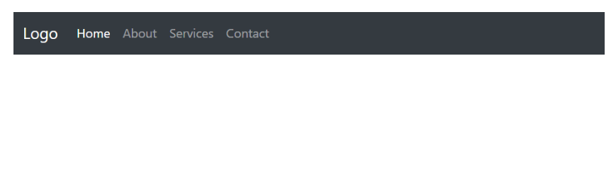
Here's an example of how to create a responsive navbar using Bootstrap:
<!DOCTYPE html>
<html>
<head>
    <title>Responsive Navbar Example</title>
    <!-- Include Bootstrap CSS -->
    <link rel="stylesheet" href="https://stackpath.bootstrapcdn.com/bootstrap/4.3.1/css/bootstrap.min.css">
</head>
<body>

<!-- Navbar -->
    <nav class="navbar navbar-expand-lg navbar-dark bg-dark">
        <a class="navbar-brand" href="#">Logo</a>
        <button class="navbar-toggler" type="button" data-toggle="collapse" data-target="#navbarNav" aria-controls="navbarNav" aria-expanded="false" aria-label="Toggle navigation">
            <span class="navbar-toggler-icon"></span>
        </button>
        <div class="collapse navbar-collapse" id="navbarNav">
            <ul class="navbar-nav">
                <li class="nav-item active">
                    <a class="nav-link" href="#">Home</a>
                </li>
                <li class="nav-item">
                    <a class="nav-link" href="#">About</a>
                </li>
                <li class="nav-item">
                    <a class="nav-link" href="#">Services</a>
                </li>
                <li class="nav-item">
                    <a class="nav-link" href="#">Contact</a>
                </li>
            </ul>
        </div>
    </nav>

    <!-- Include Bootstrap JS -->
    <script src="https://stackpath.bootstrapcdn.com/bootstrap/4.3.1/js/bootstrap.min.js"></script
    >
</body>
</html>
In the example above, we start by including the necessary Bootstrap CSS and JS files. Make sure to include them in the head section of your HTML document.
The navbar structure consists of the `<nav>` element with the `navbar` class, followed by the `navbar-expand-lg` class to make it expandable on larger screens. The `navbar-dark bg-dark` classes are used to define the navbar's color scheme.
Inside the navbar, we have a navbar-brand, which represents the logo or brand name. You can replace it with your own logo or brand name. Next, we have a button with the `navbar-toggler` class. This button will be visible on smaller screens and will toggle the collapsible menu when clicked.
The collapsible menu is defined using the `<div>` element with the `navbar-collapse` class. Inside this div, we have a `<ul>` element with the `navbar-nav` class. The `<li>` elements with the `nav-item` class represent the individual items in the navbar. You can customize the links and add more items as needed.
Finally, we include the Bootstrap JS file at the end of the body section to enable the collapsible functionality.
Save the HTML file and open it in a web browser to see the responsive navbar in action. The navbar will collapse into a hamburger menu icon on smaller screens, and the menu items will be displayed in a dropdown when the icon is clicked.
Remember to adjust the Bootstrap version and file URLs if you are using a different version or hosting the Bootstrap files locally.
Output:
About the Author

Silan Software is one of the India's leading provider of offline & online training for Java, Python, AI (Machine Learning, Deep Learning), Data Science, Software Development & many more emerging Technologies.
We provide Academic Training || Industrial Training || Corporate Training || Internship || Java || Python || AI using Python || Data Science etc


PreviousNext
Join our newsletter for the latest updates.
About us
Our Services
Contact Us
Our Courses
Learn Python | Learn AI | Learn Machine Learning | Learn Deep Learning | Learn Core Java | Learn Java JSP | Learn Java Servlet | Learn Java Spring Core | Learn Spring Boot | Learn Power BI | Learn DAA | Learn HTML | Learn SQL | Learn C Programming | Learn Bootstrap | Learn Git | Learn JavaScript | Learn Data Structure Using C | Learn RDBMS | Learn Data Science | Learn PHP
Our Tutorials
Python Tutorial | AI Tutorial | Machine Learning Tutorial | Deep Learning Tutorial | Core Java Tutorial | Java JSP Tutorial | Java Servlet Tutorial | Java Spring Tutorial | Spring Boot Tutorial | Power BI Tutorial | DAA Tutorial | HTML Tutorial | SQL Tutorial | C Programming Tutorial | Bootstrap Tutorial | Git Tutorial | JavaScript Tutorial | Data Structure Using C Tutorial | RDBMS Tutorial | Data Science Tutorial | PHP Tutorial
Copyright © 2023 Pythontpoint Powered by Silan Software Pvt. Ltd. All rights reserved.