

Create Registration form with responsive using HTML & CSS
Here's an example of a responsive registration form using HTML and CSS:
html
<!DOCTYPE html>
<html>
    <head>
        <title>Registration Form</title>
        <style>
            * {
                box-sizing: border-box;
            }

            body {
                font-family: Arial, sans-serif;
                background-color: #f2f2f2;
                margin: 0;
            }

            .container {
                max-width: 500px;
                margin: 0 auto;
                padding: 20px;
                background-color: #ffffff;
                border-radius: 5px;
                box-shadow: 0 0 5px rgba(0, 0, 0, 0.1);
            }

            h1 {
                text-align: center;
            }

            .form-group {
                margin-bottom: 20px;
            }

            label {
                display: block;
                font-weight: bold;
                margin-bottom: 5px;
            }

            input[type="text"],
            input[type="email"],
            input[type="password"] {
                width: 100%;
                padding: 10px;
                border: 1px solid #ccc;
                border-radius: 5px;
            }

            input[type="submit"] {
                width: 100%;
                padding: 10px;
                background-color: #4CAF50;
                color: #fff;
                border: none;
                border-radius: 5px;
                cursor: pointer;
            }

            @media (max-width: 600px) {
                .container {
                    max-width: 100%;
                    padding: 10px;
                }
            }
        </style>
    </head>
    <body>
        <div class="container">
            <h1>Registration Form</h1>
            <form>
                <div class="form-group">
                    <label for="username">Username:</label>
                    <input type="text" id="username" name="username" placeholder="Enter your username">
                </div>
                <div class="form-group">
                    <label for="email">Email:</label>
                    <input type="email" id="email" name="email" placeholder="Enter your email">
                </div>
                <div class="form-group">
                    <label for="password">Password:</label>
                    <input type="password" id="password" name="password" placeholder="Enter your password">
                </div>
                <div class="form-group">
                    <input type="submit" value="Register">
                </div>
            </form>
        </div>
    </body>
</html>
In this example, the form is contained within a container div with a maximum width of 500 pixels. The form elements are styled with padding, borders, and border radius to give them a clean appearance. The form is centered on the page using `margin: 0 auto`. The form input fields are set to a width of 100% to ensure they fill the available space. The form is also made responsive using a media query, which adjusts the container's maximum width and padding when the viewport width is less than or equal to 600 pixels.
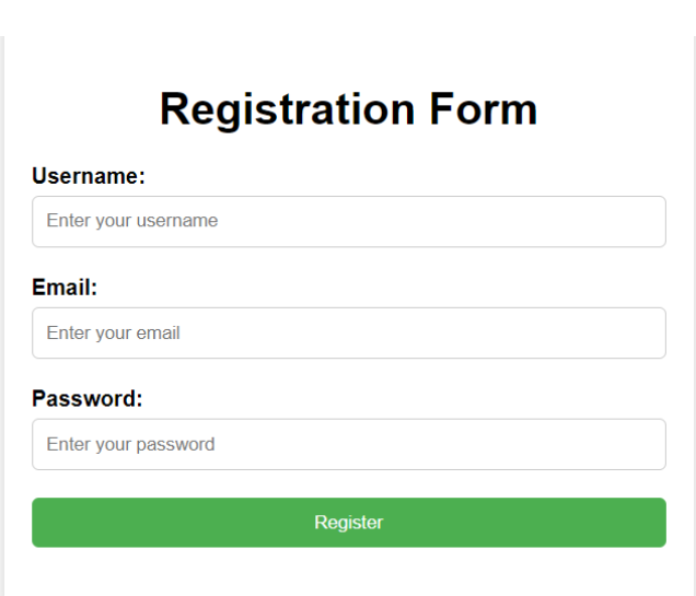
Output:
About the Author

Silan Software is one of the India's leading provider of offline & online training for Java, Python, AI (Machine Learning, Deep Learning), Data Science, Software Development & many more emerging Technologies.
We provide Academic Training || Industrial Training || Corporate Training || Internship || Java || Python || AI using Python || Data Science etc


PreviousNext
Join our newsletter for the latest updates.
About us
Our Services
Contact Us
Our Courses
Learn Python | Learn AI | Learn Machine Learning | Learn Deep Learning | Learn Core Java | Learn Java JSP | Learn Java Servlet | Learn Java Spring Core | Learn Spring Boot | Learn Power BI | Learn DAA | Learn HTML | Learn SQL | Learn C Programming | Learn Bootstrap | Learn Git | Learn JavaScript | Learn Data Structure Using C | Learn RDBMS | Learn Data Science | Learn PHP
Our Tutorials
Python Tutorial | AI Tutorial | Machine Learning Tutorial | Deep Learning Tutorial | Core Java Tutorial | Java JSP Tutorial | Java Servlet Tutorial | Java Spring Tutorial | Spring Boot Tutorial | Power BI Tutorial | DAA Tutorial | HTML Tutorial | SQL Tutorial | C Programming Tutorial | Bootstrap Tutorial | Git Tutorial | JavaScript Tutorial | Data Structure Using C Tutorial | RDBMS Tutorial | Data Science Tutorial | PHP Tutorial
Copyright © 2023 Pythontpoint Powered by Silan Software Pvt. Ltd. All rights reserved.